This digital poster has been their since I was doing a wonderful poster project.
 We have to judge the 'Font' we want size wise and style wise. So, I chose style wise and the size would automatically fit in the square. It has a depth of a word to word as you write. And the color combinations is just amazing.
 This is another kind of a poster that defines what you want rather than just scribbling something. The words typed in the different font patterns with their space, size, typeface, style and colors. Then there is shape that is built in by 3d and less.

 Now, these two posters are excellent portray of Typography. The first one has a sketch of a person so that defines the character as a male person in the background. And the font type simple one shape and size, but two contrasting colors in Fonts. The whole typography is sketched out with the mind which waves outside.

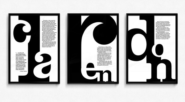 What is type face for Clarendon fonts? It is contemporary remake classic slab serif typeface.


 Here is the contrast Yellow color used as the combination with the font colors. And the font colors are different in size and shapes according to weightage of the words typed. In all I really liked the overall impression of this beautiful typography poster.
 This is a selfmade font pattern. It is digital, simple with sans serif font type generated. It could be used to showcase your typeface choices, layout abilities, and design skills.
 This magnificent canvas poster is a decorative pattern of a whimsical typography.
It is a wonderful idea in defying the pattern of Typography poster.
The second typography poster is on the future font. Once again it's simplicity and color combinations are superb.The extended lines of the words futura are well thought with the year of when the font type is made. In all the efficient, bold, modern and geometric sequence are drawn with the simplest way to tell us all about the theoretical Font.
Here is another example of Clarendon font. It describes how and when the font was generated.
https://fonts.adobe.com/fonts/clarendon-text#fonts-section
Next is my creation of Abstract font. You too can name the title of the poster.
Below is the typography posters which I recently made
And this is ofcourse digital pattern. The background color is done with a dark black and extra orangish red added to it.
This is also against a dark black background and the font colors are dark pink to ligh pink with the intention of the incredible ideas of words used.
Yeah !!! 👍🏻 👍🏻
Next is my hand made and drawn in watercolor typography poster.
It has a green leaves which are looking over the room which has a l💡mp whimsically long and the wordings go within the lamp and around the lamp. And it has circles which are dangling on the left side of the front room. Adding to this is a sketch of Two🍥 Sweets 🍥. The colors are very much bright and beautifully done by crayons and watercolor. If you ask me personally, I just love this idea of typography poster. So, what do you think about the poster? Do let me know.
Now we have come this far and I have had a great time with this project. Thank you for visiting and following the ipage blog. Next week we shall do some work on typography Logos.
Cheers,
Gcb studios
Comments
Post a Comment