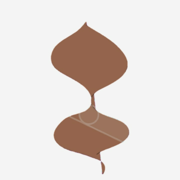
Transformation of digital pattern tile

Transformation of pattern tile 

A pattern tile is any image drawn into shape, color, size, angle, outline or transparency mask. And they have been around for centuries, commonly known as Moroccan and Talavera tiles. 

In the quaint town of Willow Creek, renowned artist Anya pevikar embarked on a daring project to transform an ordinary Victorian home into a contemporary masterpiece. The heart of her vision lay in a unique pattern tile, an intricate mosaic that evoked both the home's history and the boundless possibilities of design.

Anya meticulously laid the tiles in the grand foyer, their geometric patterns danced before her eyes. The tiles, hand-crafted from a forgotten era, possessed an ethereal glow, their colors shifting from emerald greens to sapphire blues. Each piece was a testament to the artisanship of the past, yet Anya saw in them a portal to the future.

Suddenly, as if summoned by her unwavering belief, the tiles began to shimmer. Fine lines of light traced the edges of the mosaic, creating an illusion of depth that seemed to pull one into its enigmatic embrace. To Anya's astonishment, the tiles transformed before her very eyes.

The geometric patterns morphed into ethereal shapes, swirling like distant galaxies or blooming undersea gardens. The colors became more vibrant, casting an otherworldly glow upon the room. Anya gasped in awe, her mind racing with the possibilities.

Word of the extraordinary transformation spread through Crawford Creek like wildfire. People from far and wide flocked to see the enigmatic 'Living Tile.' Some whispered of magic or divine intervention, while others marveled at the genius of Anya's design.

But Anya knew that the true power of the tiles lay not only in their aesthetic beauty but in their ability to inspire transformation. She realized that the tiles represented the transformative nature of both art and graphic design. They served as a reminder that even the most ordinary of spaces could be imbued with magic if one dared to dream.

And so, the Victorian home in Crawford Creek became a beacon of hope and inspiration for all who visited it. The Living Tile became an icon of the transformative power of art and the boundless potential of human imagination. And as the years passed, the tiles continued to shimmer and dance, reminding people of the transformative journey that had begun within their walls.

Anya, who had done a wonderful wavy lines transformation to an image filled with color and then combining it into a geometric leaf ๐Ÿ€ shape pattern. 

Which in turn got a Transformation into orangish brown color and wavy leafy style.

 Double layers of orangish brown color and wavy leafy style was again transfered into an amazing perpetua look. Widely used as a text face in quality books, Perpetua is also very popular in advertising and display work. It is everlasting as in advertisement. It was a Perpetua pattern, its intricate design of interlocking squares and circles a familiar comfort. This tile, however, was different. The orangish brown gradient with dark purple smudged into the background. And each tile is joined together making it look like strings attached.

 Here, the pattern tile is different than earlier. It's white background where brown colored image and shapes into a geometric sequence of diamond and Hexagon. A six-sided tile that can be arranged in colourful patterns to create a unique and stylish image.

Gradient
A part sloping upward and downward gradient.

- Ruling gradient. Ruling gradient is the steepest grade allowed on the railway track section. ...
- Momentum Gradient. The momentum gradient is steeper as compared to the ruling gradient. ...
- Pusher or Helper gradient. A pusher or helper gradient is provided when the ruling gradient is very severe. ...
- Gradients in station yards.

color values ways of representing the colors we see everyday in a format that a computer can interpret and display. Commonly used in websites and other software applications. A hue (red, blue yellow, etc), intensity (saturation), and value. Value is how light or dark a color is on a scale from 1 to 10.

For example 
1
2
This is complete pattern of Floral tile or  an image.

I had a wonderful day in showcasing the pattern tile. Thank you so very much for your time and support in visiting my ipage blog. Next week we will continue on Graphic designs. 

Cheers,
Gcb studios 

Comments

Popular posts from this blog

Concept of Creativity

  The "new concept of creative" generally refers to   an overarching, innovative theme or idea   that serves as the foundation for a project or campaign, moving beyond simple individual ideas to a holistic, memorable message.   Key Aspects of the "New Concept of Creative" Novelty and Usefulness:  Creativity is defined as the ability to produce work that is both original (novel) and appropriate (useful or adaptive to task constraints). Overarching Theme:  A strong concept is not just an entertaining idea, but a foundational idea that can be sustained across various media and over time (e.g., Nike's "Just Do It"). It provides a consistent story and direction for all related communications. Emotional Connection:  Successful creative concepts often evoke an emotional response, which helps in connecting with the target audience and making the message memorable. Alignment with Values:  Modern concepts emphasize staying true to brand or community values,...

InDesign project

  InDesign Graphic Design Key Concepts and Uses Overview: Adobe InDesign is a professional desktop publishing software widely used for creating layouts for print and digital media. It’s a staple tool for graphic designers, especially in editorial, marketing, and publishing industries. Core Uses: Magazine and newspaper layouts Brochures and flyers Books and eBooks Posters and advertisements Interactive PDFs and digital publications Key Features: Master Pages: Create consistent layouts across multiple pages. Typography Control: Advanced tools for kerning, tracking, leading, and styles. Grid Systems: Align and organize content precisely. Linked Assets: Place images and graphics that update automatically when edited. Preflight and Packaging: Check files for errors and gather all assets for printing. Design Tips: Use paragraph and character styles for consistent text formatting. Leverage layers to organize complex layouts. Utilize color swatches and libraries for brand consistency. Expo...

Baseline grid

Here’s a draft document explaining baseline grid design, including an example. Understanding Baseline Grid Design.. What is a Baseline Grid? A baseline grid is an invisible set of horizontal lines that helps designers align text and other elements consistently across a page or screen. Think of it as the “invisible lined paper” for your design, ensuring that every line of text sits on the same horizontal plane, creating a harmonious and organized look. Why Use a Baseline Grid? Consistency: Ensures all text lines up perfectly, making your design look neat and professional. Readability: Improves the reading experience by providing a predictable rhythm for the eyes to follow. Alignment: Helps align images, icons, and other elements with text for a cohesive layout. How to Set Up a Baseline Grid Choose a Base Line Height: Start by selecting a line height for your body text (e.g., 16px or 24px). This becomes the spacing between each line of your grid. Apply the Grid: Overlay the baseline grid...