Hello!!! 🙋🏻♀️
Once again I am here bringing the Graphic designs to a whole new level which is "Text" and "Font". .
Here's a comprehensive description of graphic design fonts and text effects:
Fonts
1. *Serif Fonts*: Traditional fonts with small lines or flourishes at the ends of the strokes (e.g., Times New Roman).
2. *Sans-Serif Fonts*: Modern fonts without the small lines or flourishes (e.g., Helvetica, Arial).
3. *Script Fonts*: Fonts that mimic handwriting or calligraphy (e.g., Lobster, Pacifico).
4. *Display Fonts*: Decorative fonts used for headings or titles (e.g., Impact, Museo).
Text Effects
1. *Drop Shadow*: A shadow effect that creates depth and dimension.
2. *Gradient*: A gradual transition from one color to another, often used for a modern look.
3. *Outline*: A border around the text, which can be customized in color, width, and style.
4. *Emboss*: A 3D effect that makes the text appear raised or sunken.
5. *Bevel*: A 3D effect that creates a sloping edge around the text.
6. *Glow*: A radiant effect that makes the text appear to glow.
7. *Reflection*: A mirror-like effect that creates a reflection of the text.
Advanced Text Effects
1. *Text Wrap*: Wrapping text around an object or image.
2. *Text Path*: Creating a custom path for text to follow.
3. *Text Styles*: Applying multiple styles to a single text layer (e.g., bold, italic, underline).
4. *Layer Styles*: Applying effects like drop shadows, glows, or outlines to a text layer.
Best Practices
1. *Legibility*: Choose fonts and text effects that maintain readability.
2. *Consistency*: Establish a consistent typography style throughout your design.
3. *Hierarchy*: Use font sizes, colors, and styles to create a clear visual hierarchy.
4. *Balance*: Balance text with images and negative space to create a visually appealing design.
Yes, there are many other ways to create different patterns of fonts and text effects. Here are some additional techniques:
Font Patterns
1. *Font Stacking*: Layering multiple fonts on top of each other to create a unique look.
2. *Font Combinations*: Pairing different fonts to create contrast and visual interest.
3. *Typographic Hierarchies*: Using font sizes, colors, and styles to create a clear visual hierarchy.
4. *Kerning and Tracking*: Adjusting the spacing between letters to create a custom look.
Text Effects Patterns
1. *Multi-Color Gradients*: Creating gradients with multiple colors to add depth and visual interest.
2. *Pattern Overlays*: Overlaying patterns, such as stripes or polka dots, onto text.
3. *Textured Text*: Adding texture to text using layer styles or overlays.
4. *Animated Text*: Creating animated text effects using CSS or animation software.
Advanced Techniques
1. *Variable Fonts*: Using variable fonts to create custom font styles and animations.
2. *CSS Text Effects*: Using CSS to create custom text effects, such as 3D transformations and animations.
3. *JavaScript Text Effects*: Using JavaScript to create interactive text effects, such as hover effects and scrolling animations.
4. *Graphic Design Software*: Using graphic design software, such as Adobe Photoshop and Illustrator, to create custom text effects and patterns.
Online Tools and Resources
1. *Font Generators*: Using online font generators to create custom fonts and text effects.
2. *Text Effect Generators*: Using online text effect generators to create custom text effects, such as glows and shadows.
3. *Graphic Design Communities*: Joining online graphic design communities to share knowledge and learn from others.
4. *Tutorials and Courses*: Taking online tutorials and courses to learn new techniques and improve skills.
Here's a breakdown of how to create text effects in vector art:
1. Creating Text Objects:
Type or Import: Use the text tool in your vector software (like Illustrator or CorelDRAW) to type in your text, or import a font or logo from another source.
Font Selection: Choose a font that suits your design needs.
2. Applying Text Effects:
Properties Panel:
Use the properties panel, appearance panel, the effects menu, or the tools panel to apply different effects.
3. Common Effects:
Some common effects include:
Shadows: Create depth and contrast with drop shadows or other shadow effects.
Outlines: Add outlines to the text for borders or patterns.
Gradients: Fill the text with a gradient to create smooth transitions between colors.
3D Effects: Give your text a three-dimensional look with 3D effects or extrusion and bevel effects.
Warp/Distort: Use warp or distort effects to create curved, twisted, or distorted shapes.
Outlining (Vectorizing Text):
For greater flexibility and when you need to modify individual parts of the text as shapes, you can outline the text to convert it into vector shapes. This makes the text non-editable as text but allows you to edit the shapes freely.
3. Software-Specific Techniques:
Adobe Illustrator:
Illustrator offers many features, including the ability to apply effects to text directly, create 3D effects, and manipulate text using the warp tool. You can also save text effects as graphic styles for easy reuse.
CorelDRAW:
CorelDRAW also provides a range of text effects and tools for manipulating text.
4. Additional Tips
Layer Management:
Use layers to organize and group your text and effects, especially when using multiple effects or shapes.
The parallels between writing and design are strongest when it comes to building context and good content strategy.
Emotional Context -
How does the user feel when they are using your product - not just during but before and after? Are they initially open minded but then slowly confused? Are they constantly engaged? At what point does engagement/retention take a dip?
What’s their mental state surrounding the product/intention behind using the product; are they using it to alleviate boredom, is it something they use as a time filler, is it something used during a medical emergency, is it fulfilling a specific need/want of theirs?
Environmental Context -
Where exactly is the user when they’re using the product?
What situation are they in?
Who is around them?
What are they doing with their hands?
Are they stationary or in transit?
Who else/what else is fighting for their attention?
Are there time constraints?
Are the using the product while driving or in the office or while at home?
Social Context -
How will they be perceived by others when using your product?
Will it make them feel cool or proud or shy or embarrassed?
Do they require external help when using your product?
Do they need your product to help them with a problem that's otherwise too embarrassing to share with others?
Do they feel the need to share the knowledge of this product with others?
Does the product impact their social image in any way?
What Is Text Structure and How To Teach It Effectively
When students can identify and recognize different structures in text, they’re more likely to increase their comprehension of a text, strengthen their writing skills, and develop even more literacy skills, like finding the main idea of a passage. In this article, we’ll explore what text structure is, why teaching it matters, and give examples of strategies you can use to teach text structure in your classroom.
What is text effects and What is text structure?
Here's a comprehensive list of text effects:
Basic Text Effects
1. *Bold*: Making text thicker and heavier.
2. *Italic*: Slanting text to the right.
3. *Underline*: Adding a line underneath the text.
4. *Strikethrough*: Adding a line through the middle of the text.
5. *Subscript*: Lowering the text below the normal line.
6. *Superscript*: Raising the text above the normal line.
Advanced Text Effects
1. *Shadow*: Adding a shadow effect to the text.
2. *Glow*: Adding a glowing effect to the text.
3. *Outline*: Adding an outline around the text.
4. *Emboss*: Creating a raised effect on the text.
5. *Engrave*: Creating a sunken effect on the text.
6. *Bevel*: Creating a sloping edge around the text.
3D Text Effects
1. *3D Extrusion*: Extending the text into a 3D shape.
2. *3D Rotation*: Rotating the text in 3D space.
3. *3D Reflection*: Adding a reflective surface to the text.
Gradient and Pattern Text Effects
1. *Gradient Fill*: Filling the text with a gradient color.
2. *Pattern Fill*: Filling the text with a pattern.
3. *Texture*: Adding a texture to the text.
Animation and Interactive Text Effects
1. *Animation*: Animating the text using keyframes or tweens.
2. *Hover Effects*: Changing the text effect on hover.
3. *Click Effects*: Changing the text effect on click.
Other Text Effects
1. *Blur*: Blurring the text.
2. *Noise*: Adding noise to the text.
3. *Distortion*: Distorting the text using various algorithms.
This is not an exhaustive list, and text effects can vary depending on the software or platform being used.
Text structure is the way an author organizes the information within a text. It’s more than just the basic structure of beginning, middle, and end. The structure of a text serves as an outline or skeleton that helps the writer frame the story they want to tell. The specific type of text structure an author uses lets them share different types of information in a way that helps the reader clearly understand the text’s main idea and key points.
Why is teaching text structure important?
Teaching text structure in the classroom is just one of many literacy skills that help students understand, analyze, and make sense of the world around them. With intentional instruction, teaching text structure can:
- Aid students in understanding the author’s meaning for creating and sharing a text.
- Help students improve their comprehension of any text they encounter, both fiction and nonfiction across subjects like ELA, science, and social studies.
- Boost practice and comprehension of other literacy skills, like predicting outcomes, summarizing information, and identifying key concepts and relationships.
- Prepare students to learn to organize and write their own thoughts and ideas.
A well-structured text enables the reader to follow the argument and navigate the text. In academic writing a clear structure and a logical flow are imperative to a cohesive text.

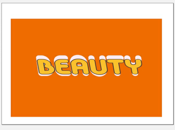
Here, a text effects work as they have a good point, because they have a background shape and effect. Then they have a text "Creative", with the combination of color and texture and design pattern. Then any spectators who sees the image definitely likes it and accepts it as the layering of the word is locked.
Text structure is a powerful tool for improving reading comprehension because it helps spectators organize ideas and concepts from a text and synthesize the information they are learning.
For example: Its primary purpose is to inform the reader about the natural or social world. Different from fiction, and other forms of nonfiction, informational text does not utilize characters. Further, it has specialized language characteristics such as general nouns and timeless verbs that are not common in other genres. Some examples of this structure would be: “Some snakes are quite deadly;” or “Apples can be red, yellow, or even green!”.
"Colors are in variation on paper or computer and when printer is used".
Monitors display color using the RGB color model, meaning they create color by mixing red, green, and blue. All monitors use RGB, but the display typically varies from screen to screen. It’s affected by the device’s graphics card, and also by its backlighting — whether it uses LED, LCD, or plasma.
Inkjet printers use the CMYK color model, producing color with cyan, magenta, yellow, and black. Again, colors often vary from printer to printer due to their settings.
Offset presses may use either CMYK or spot colors, which are created by mixing specific proportions of ink. The most popular spot colors are created by Pantone, which mixes 14 base colors. If you’re looking to get an exact color match, use Pantone. (This method can be a little pricey, though, and is not the best option for every job.)
Why colors you see on a computer screen may look different when printed out on paper?
Due to the nature of light (Screens, RGB) versus ink (CMYK, Pantones, etc) and the fact that pretty much every monitor will display the colour slightly differently and print will look different in different lights. This kind of colour management is a job in itself.
Pigments that are more soluble in the solvent move more quickly and further than pigments that are less soluble. This causes different pigments to end up in different places on the chromatography paper, resulting in a separation of pigments.
Text structure is given specificity to help both authors convey their message effectively and readers comprehend it, as different structures are suited for different types of information and purposes.
Here's a more detailed explanation:
Authorial Purpose:
Writers intentionally choose specific structures like description, sequence, compare/contrast, cause/effect, or problem/solution to organize information in a way that best serves their purpose.
For instance, a recipe uses a sequential structure to guide the reader through steps.
A persuasive essay might use a problem/solution structure to argue a point and propose a solution.
Reader Comprehension:
Understanding text structure enables readers to follow the flow of information, identify key ideas, and anticipate what comes next.
Knowing that a text uses a cause/effect structure allows readers to anticipate the consequences of certain actions or events.
Recognizing a compare/contrast structure helps readers identify similarities and differences.
Examples of Text Structures and Their Purposes:
Description: To paint a picture in the reader's mind, providing detailed descriptions of places, people, or events.
Sequence/Chronological Order: To present information in a time order, like the steps in a procedure or events in a story.
Compare/Contrast: To examine the similarities and differences between two or more things.
Cause and Effect: To explain why something happened or the consequences of an event.
Problem and Solution: To present a problem and then offer one or more possible solutions.
"Text effects may refer to any of the following:
1. In general, text effects are modifications made to text to make it more attractive or expressive. Some examples of basic text effects include bold, italic, underline, strikethrough, shadow, glow, gradient, emboss, and outline.
"Text effects may refer to any of the following:
2 In Microsoft Word, the Text Effects and Typography feature lets you add a unique flair to characters. This setting is on the Home tab of the Ribbon, in the Font section. It looks like a capital outlined blue "A," as shown in the image.
Once clicked, you are presented with the text effects listed in the following sections. The picture below is an example of text created using a combination of the four options.
Computer Hope written in text with Microsoft Word text effects applied.
3.Outline
Outline is a text effect that lets you place a small line around each text character. You can define the color of the line, its size (weight), and its style. In our example picture, we chose a solid blue line around the black "Computer Hope" text.
4.Shadow
The shadow effect lets you create an outer shadow, inner shadow, and perspective shadow. In our example picture, we chose a perspective shadow that appears behind the text.
5.Reflection
The reflection effect shows how the text would appear if it were next to a reflective surface, like ice or water. Our example picture has a full reflection with high transparency.
6.Glow
The glow effect makes text appear as if it's glowing in any color and intensity of your choice. In our example picture, we applied a very light yellow glow.
7.Number Styles
In Number Styles, you can adjust how numbers appear in a numbered list. The following five options are available.
8.Default - Style recommended for your font.
Proportional Lining - Full-height numbers, spaced proportionally.
Tabular Lining - Full-height numbers, spaced equally.
Proportional Old-style - Numbers that read well with the text.
Tabular Old-style - Numbers that are highly legible and spaced equally.
9.Ligatures
In Ligatures, you can adjust how a ligature appears or doesn't appear on text. The following five options are available.
None - Disables all ligatures in the selected text.
Standard Only - Enables ligatures to improve text readability.
Standard and Contextual - Enables additional ligatures found in contextual printing.
Historical and Discretionary - Enables ligatures found in historical printing and ligatures for stylistic effect.
All Ligatures - Enables all ligatures available in the selected text.
It's a way of organizing information where the writer first talks about an event or action (the cause) and then describes what happens next because of that event or action (the effect).
Now here it is quite different because it is the font used. I generated a text-based representation of font effects earlier. I didn't send an actual image. However, I can describe what an image with font effects might look like:
Imagine a graphic with the words "Font Effects" written in a bold, 3D font with a shiny, metallic finish. The text is surrounded by a subtle glow effect, making it stand out against a dark or gradient background.
The letters themselves might be decorated with intricate patterns, such as stripes or swirls, and could be raised or embossed to give the impression of depth. Some letters might be highlighted in bright, neon colors, while others might be shaded or shadowed to add dimension.
The overall effect would be eye-catching and dynamic, showcasing various font effects and styles in a visually appealing way.
Here's a comprehensive list of font effects:
1. 3D Effects
1. *3D Extrusion*: Extending the text into a 3D shape.
2. *3D Rotation*: Rotating the text in 3D space.
3. *3D Reflection*: Adding a reflective surface to the text.
2. Shadow Effects
1. *Drop Shadow*: Adding a shadow below the text.
2. *Inner Shadow*: Adding a shadow inside the text.
3. *Outer Shadow*: Adding a shadow outside the text.
3. Glow and Neon Effects
1. *Glow*: Adding a glowing effect to the text.
2. *Neon*: Adding a neon-like effect to the text.
3. *Fluorescent*: Adding a fluorescent-like effect to the text.
4. Outline and Border Effects
1. *Outline*: Adding an outline around the text.
2. *Border*: Adding a border around the text.
3. *Stroke*: Adding a stroke effect to the text.
5. Distortion and Transformation Effects
1. *Blur*: Blurring the text.
2. *Distort*: Distorting the text using various algorithms.
3. *Transform*: Transforming the text using various algorithms.
6. Pattern and Texture Effects
1. *Pattern Fill*: Filling the text with a pattern.
2. *Texture*: Adding a texture to the text.
3. *Gradient*: Adding a gradient effect to the text.
7. Animation and Interactive Effects
1. *Animation*: Animating the text using keyframes or tweens.
2. *Hover Effects*: Changing the text effect on hover.
3. *Click Effects*: Changing the text effect on click.
8. Other Effects
1. *Emboss*: Creating a raised effect on the text.
2. *Engrave*: Creating a sunken effect on the text.
3. *Bevel*: Creating a sloping edge around the text.
4. *Sculpt*: Creating a 3D-like effect on the text.
This is not an exhaustive list, and font effects can vary depending on the software or platform being used.
Righto! Glad we're on the same page! If you have any more questions or need help with anything else, feel free to ask!
Here's a conclusion for text and font effects:
Text and font effects play a crucial role in enhancing the visual appeal and readability of written content. With a wide range of effects available, designers and writers can add depth, emotion, and personality to their text.
From simple effects like bold and italic to advanced effects like 3D extrusions and animations, text and font effects can help convey the tone and message of the content.
By strategically using text and font effects, creators can:
- Grab the reader's attention
- Emphasize important information
- Create visual hierarchy and balance
- Enhance the overall aesthetic appeal of the content
Whether you're designing a website, creating a social media post, or writing a blog, text and font effects can help elevate your content and engage your audience.
Thank you for your help and support in visiting my ipage blog. It is like coming back to work after a long break.
I shall see you next week with some interesting things in Graphic designs.
Have a lovely day! ⊂((・▽・))⊃
Cheers,
Gcb studios


Comments
Post a Comment