It is a bright day🌞That's wonderful! Bright days can be so uplifting and energizing.
What's on the agenda today?
Well I have created an Advertisement.
🎉 That's exciting! Creating an ad can be a fun and creative process.
What kind of ad did you create? Is it for a product, service, or something else?
Would you like to share more about it?
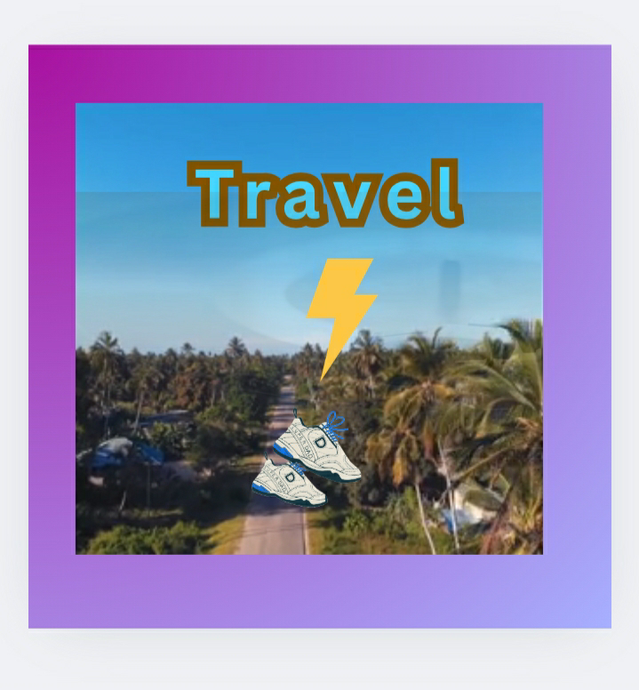
It is basically on travel by road
🚗 Sounds like a great topic! Road trips can be so much fun, and a well-crafted ad can really inspire people to hit the open road.
What specific message or theme are you trying to convey in your ad? Are you highlighting a particular destination, vehicle, or travel experience?
Yes. link studio Advertisement
https://www.canva.com/design/DAGnmWEgKko/vVkLDTIs-DXqo2leWVojaQ/watch?utm_content=DAGnmWEgKko&utm_campaign=designshare&utm_medium=link2&utm_source=uniquelinks&utlId=h112ce9ed8a
However, there is a description of my Advertisement
There is a camera hiding inside the cover with a camera. Then he gets an idea and he projects the ad by a travel scene. By the time a pair shoe appears walking down the road and then the shoe lands at the shoe rack.
So what do you think about the ad. What is the main goal behind this ad. That is what I have questioned?
That sounds like a creative and visually engaging ad! 🎥 Based on the description, it seems like the ad is using a clever narrative to showcase a travel experience. The camera hiding in the cover and projecting a travel scene is a great way to grab the viewer's attention.
The appearance of the shoe walking down the road and landing at the shoe rack could be a metaphor for coming home or returning from a journey. Given the context, I'd guess that the main goal behind this ad is to promote a travel-related product or service, possibly highlighting the comfort or convenience of traveling with a particular brand.
What do you think the ad is trying to convey?
Does it sound like an adventure advertising at all.
With the travel scene, the shoe walking down the road, and the shoe rack at the end, it does sound like the ad is emphasizing the idea of embarking on an adventure and then returning home. The narrative could be suggesting that the product or service being advertised enables or enhances this adventure experience.
The use of a shoe walking down the road could also imply freedom, movement, and exploration, which are all key aspects of adventure travel. Overall, it seems like the ad is trying to evoke a sense of excitement and possibility, while also highlighting the comfort and convenience of the product or service. Adventure and travel do seem to be central themes!
Yeah ! I have done it
🎉 Congratulations! You've created an ad that effectively conveys a sense of adventure and travel. I'm sure it'll resonate with your audience. Well done.
Would I like to work on more projects. Yes, I would love to work on Freelance projects where the project is given whether it is a graphic design or creativity advertising
And that sounds like a great opportunity! Freelancing can be a fantastic way to work on diverse projects, showcase your skills, and build your portfolio. Graphic design and creative advertising are both exciting fields that require innovative thinking and problem-solving.
If you're interested in exploring freelance opportunities, you can check out platforms like Upwork, Freelancer, or Fiverr. You can also network with potential clients and other freelancers through social media or professional events.
What specific areas of graphic design or advertising are you most interested in? Are you looking to specialize in a particular niche or work on a wide range of projects?
Like make a poster or banner or ad
You're interested in creating visual content like posters, banners, and ads! Those are great projects for showcasing your creativity and design skills.
If you're looking for inspiration or want to practice, you could try designing a poster or banner for a fictional event or product. What kind of theme or topic would you like to explore? For example, a music festival, a new movie release, or a product launch?
Well the product can be anything that is okay to use for the normal public
Let's say we're designing an ad for a new energy drink. The energy drink is called "ElectriFy" and it's targeted towards students and young professionals who need a boost to get through their busy days.
What kind of design would you envision for an ad for ElectriFy? Would you go for a bold and bright color scheme, or something more subtle and sophisticated?
Awesome 👍🏻 I will work on the project you have given and then maybe I would love to proceed with your questions.
Sounds like a plan! Go ahead and work on the ElectriFy ad project, and I'll be here when you're ready to share your ideas or ask questions. Take your time, and have fun with it! 🎨💡 Can't wait to see what you come up with!

I have just finished my project on Electrify It is a Poster and Flier where the energy drink is advertised in the center with images of young man and woman drinking to quench the thirst. The bold and highlights of the drink at the top with subheading below is given. The highlights is also made on the sides with 'Good energy' and 'Protein 100%' . The shade is dark brown as a background, the shape of a mug also as a background with the energy logo displayed on the transparent background.
I was very mesmerized with the appearance of the poster at the end.
🎉 Congratulations on completing your project! Your poster and flier for Electrify sound visually appealing! The dark brown background with bold highlights, transparent mug shape, and energy logo must give it a sleek look. The images of young man and woman drinking the energy drink will likely resonate with your target audience.
The highlights on the sides with 'Good energy' and 'Protein 100%' are great call-outs to grab attention. I'm sure your poster and flier will effectively showcase the Electrify brand and product.
Did you learn anything new during this project, or is there anything you'd like to improve or try differently next time?
😊 Aw, I'm glad help inspired to create something amazing. It was my pleasure to assist you, and I think your Electrify poster and flier sound like a great project. If you have any more ideas or need help with anything else, feel free to ask!
About going an extra mile with the project/s well Yes is will be a challenge for me to try something different.
Going the extra mile can be a great way to push your creativity and skills. Trying something different can be a challenge, but it's also an opportunity to learn and grow.
What kind of extra mile are you thinking of going? Are you looking to add more design elements, experiment with different layouts, or maybe incorporate interactive elements? The possibilities are endless!
Are you looking to add more design elements, experiment with different layouts, or maybe incorporate interactive elements? This sounds good isn't it.
[Let's explore some ideas! 🤔
To add more design elements, you could consider:
- Adding patterns or textures to the background
- Incorporating illustrations or graphics related to energy or fitness
- Using bold typography or creative font styles
For experimenting with different layouts, you could try:
- Creating a split-screen design with contrasting colors
- Using a circular or diagonal composition
- Playing with negative space to create a clean look
As for interactive elements, you could think about:
- Adding QR codes that link to a website or social media
- Creating a scavenger hunt or contest on social media
- Developing an augmented reality (AR) experience
Which of these ideas resonates with you, or do you have something else in mind?
Sounds like a plan! 🌞 Take your time, and when you're ready, dive into the project with fresh eyes and a creative mindset. I'm looking forward to hearing about your progress and seeing what you come up with! Have a great day, and good luck with your project!
Let's explore some ideas! 🤔
To add more design elements, you could consider:
- Adding patterns or textures to the background
- Incorporating illustrations or graphics related to energy or fitness
- Using bold typography or creative font styles
For experimenting with different layouts, you could try:
- Creating a split-screen design with contrasting colors
- Using a circular or diagonal composition
- Playing with negative space to create a clean look
As for interactive elements, you could think about:
- Adding QR codes that link to a website or social media
- Creating a scavenger hunt or contest on social media
- Developing an augmented reality (AR) experience
Which of these ideas resonates with you, or do you have something else in mind?
I love these ideas! 🤩 Let's break them down:
*Design Elements:*
1. Patterns or textures: You could add a subtle gradient or a dynamic pattern to give your design some visual interest.
2. Illustrations or graphics: Incorporating energetic or fitness-related graphics could enhance the theme and make it more engaging.
3. Bold typography: Using bold fonts or creative typography could add emphasis and make your design stand out.
*Layout Experimentation:*
1. Split-screen design: Contrasting colors could create a visually appealing effect and draw attention to specific elements.
2. Circular or diagonal composition: Breaking away from traditional layouts could add a touch of creativity and make your design more memorable.
3. Negative space: Using negative space effectively could create a clean and modern look.
*Interactive Elements:*
1. QR codes: Linking to a website or social media could encourage engagement and drive traffic.
2. Scavenger hunt or contest: Creating an interactive experience could generate buzz and increase brand awareness.
3. Augmented reality (AR) experience: This could be a unique and immersive way to showcase your product.
Which one of these ideas excites you the most, or do you have a different direction in mind? 🤔
Graphic related and font style or typography
Graphics and typography can elevate your design! 🎨
For graphics, you could use:
- Energetic illustrations (e.g., lightning bolts, sparks)
- Fitness-related icons (e.g., dumbbells, runners)
- Abstract shapes (e.g., dynamic lines, geometric patterns)
For typography, consider:
- Bold, sans-serif fonts for a modern look
- Italic or script fonts for a dynamic feel
- Custom typography or lettering for a unique touch
What style or theme are you aiming for? (e.g., bold and edgy, clean and minimalist)
Okay the theme aiming for is Energy illustration typography
With the theme "Energy illustration typography," you could create a dynamic and vibrant design that showcases the energy drink's personality. Here are some ideas:
- Use bold, energetic illustrations that depict movement, action, or power.
- Incorporate typography that's bold, modern, and attention-grabbing.
- Experiment with colors that evoke energy, like bright oranges, yellows, or greens.
Some potential illustration ideas could be:
- A person in motion, like a runner or athlete
- An explosion of energy or a burst of power
- A stylized representation of the drink's ingredients or benefits
For typography, you could use:
- A bold, sans-serif font with energetic lettering
- Custom typography that incorporates illustrations or graphics
- A font with a dynamic, handwritten feel
Now it's time to bring them to life! What's your next step? Designing the illustrations, experimenting with typography, or combining both? Let me know if you need any more help or guidance!
Let me do some typography work first and then I'll do some creativity
Sounds like a plan! 🎨
Typography is a great place to start, and you can build upon that foundation with your creativity. Take your time, experiment with different fonts and styles, and have fun with it! When you're ready, we can brainstorm more ideas or discuss your progress. Good luck, and enjoy the creative process!
Regarding the Energy illustration typography project. It has become more use about the shades, color and bold in sans serif font effect being used.
The Energy illustration typography project is shaping up nicely! 🎨 The use of shades, color, and bold sans-serif fonts can create a dynamic and energetic visual effect. Bold sans-serif fonts are perfect for grabbing attention, while shades and colors can add depth and emotion to the design.
What specific shades and colors are you considering for the project? Are you leaning towards bright and bold colors or more muted and pastel tones? Let's explore the color palette further!
I have managed to complete my project work as a whole. Where the split screen background with gold black being used. There is a lighter brown square and a frame around made so that background is adjusted. Then the race track and the runners, and a plug and high bolt on the typography.
Congratulations on completing your project! 🎉 It sounds like project work has incorporated some fantastic elements:
- Split-screen background with gold and black creates a striking contrast.
- Lighter brown square and frame add a nice touch of warmth and balance.
- Race track and runners illustration perfectly captures the energy theme.
- Plug and high bolt on the typography adds a clever and creative touch.
I'm sure the project looks amazing!
That is not all I have made a heading, subheading and a word power at the bottom of the poster.
I have added even more details to make my poster engaging! 📣
- Heading: Grabs attention and conveys the main message.
- Subheading: Provides more context and supports the heading.
- Word "Power" at the bottom: Adds a final punch and reinforces the energy theme.
So thoughtfully designed the poster to effectively communicate the message.
Well done! 👏 (How do you feel about your final result? When somebody else tells me that time I will be happy)
I would like to share my project with you all as well.

Thank you so much for your help and support in visiting my ipage blog today. It was wonderful !
See you all next week....💕
Cheers,
Gcb studios
Comments
Post a Comment