Blue is also associated with spirituality and the quest to find answers.
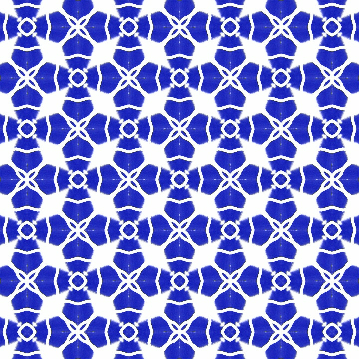
Cerulean Floral is a design style that combines:
1. Cerulean: A bright blue color reminiscent of clear skies and calm waters, evoking feelings of serenity and tranquility.
2. Floral: Delicate, whimsical flower patterns, often featuring blooming wildflowers, garden roses, or peonies, symbolizing growth, beauty, and elegance.
In Cerulean Floral, the calming blue tone provides a soothing background for lush, vibrant flowers, creating a:
- Peaceful and serene atmosphere
- Sense of natural beauty and wonder
- Whimsical and romantic feel
- Balance of cool tones and warm, floral accents
This style is perfect for designs where you want to evoke a sense of calmness, elegance, and connection to nature, such as:
- Home decor and textiles
- Wedding invitations and stationery
- Packaging for natural products or wellness brands
- Wall art and illustrations
Cerulean Floral is a lovely combination of colors and patterns that will bring a touch of serenity and beauty to any design!

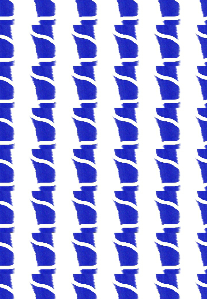
1. Cerulean: A soft, serene blue color (as described earlier)
2. Petal: Delicate, rounded shapes resembling flower petals, often with soft, gentle curves and edges
In Cerulean Petal, the calming blue color is used to create gentle, petal-like shapes, evoking:
- Softness and delicacy
- Gentle, soothing curves
- Whimsical, romantic feel
- Connection to nature and flowers
Cerulean Petal can be used as:
- A single design element, like a stylized icon or motif
- A repeating pattern, creating a calming and serene texture
- A decorative accent, adding a touch of elegance and whimsy
This design element is perfect for:
- Feminine and wellness-focused branding
- Floral and botanical-inspired designs
- Soothing and calming environments, like spas or bedrooms
- Delicate and elegant packaging, like perfume or skincare.
Cerulean Petal brings a touch of serenity, softness, and beauty to any design!


AI-Drawn Pattern Tiles:
1. *Precision*: AI-drawn patterns have precise lines, shapes, and repeats.
2. *Consistency*: AI ensures consistent design elements throughout the pattern.
3. *Speed*: AI generates patterns quickly, saving time and effort.
4. *Scalability*: AI-drawn patterns can be easily scaled up or down without losing quality.
5. *Repeatability*: AI can create seamless repeats with ease.

Hand-Drawn Pattern Tiles:
1. *Organic feel*: Hand-drawn patterns have a unique, human touch and imperfections.
2. *Character*: Hand-drawn designs often exhibit personality and emotion.
3. *Uniqueness*: Each hand-drawn pattern is one-of-a-kind, with subtle variations.
4. *Texture*: Hand-drawn patterns can incorporate natural textures and media.
5. *Human touch*: Hand-drawn designs convey the artist's skill and craftsmanship.
While AI-drawn patterns offer precision and speed, hand-drawn patterns provide a unique, personal touch and organic feel. Many designers combine both techniques to achieve a balanced look.
But, for me the hand drawn or painted pattern tile is more of a daily prayers. And, it also develops our physical and mental activity.
We have now realized that if one just maintains that morality and strength one can achieve the final outcome.
Thank you very much for your time and support in visiting my ipage blog. See you soon.
Cheers,
Gcb studios
Comments
Post a Comment