
Cubism Blue texture art
What to consider, when it comes to achieving the design in graphics?
To achieve a design in graphics, consider the following key elements:
1. *Balance*: Harmonious arrangement of visual elements.
2. *Contrast*: Use of color, size, and texture to create visual interest.
3. *Alignment*: Organizing elements along a grid or axis.
4. *Proximity*: Grouping related elements together.
5. *Repetition*: Consistent use of design elements.
6. *Color*: Selecting colors that evoke emotions and convey meaning.
7. *Typography*: Choosing fonts that communicate the message.
8. *Imagery*: Selecting graphics, illustrations, or photos that enhance the message.
9. *Texture*: Adding depth with visual or tactile texture.
10. *Space*: Using negative space to create a clean and simple design.
Additionally, consider the following design principles:
1. *Simplicity*: Clarity and ease of understanding.
2. *Hierarchy*: Organizing elements by importance.
3. *Unity*: Visual coherence and consistency.
4. *Emphasis*: Drawing attention to key elements.
5. *Movement*: Guiding the viewer's eye through the design.
By applying these elements and principles, you'll be well on your way to achieving a visually appealing and effective graphic design!
Graphic design for greeting cards involves creating visually appealing and meaningful designs for various occasions, such as:
1. Birthdays
2. Holidays (Christmas, Halloween, etc.)
3. Special occasions (Weddings, Anniversaries, etc.)
4. Everyday moments (Thank You, Congratulations, etc.)
When designing greeting cards, consider:
1. Color schemes: Choose colors that match the occasion and evoke the right emotions.
2. Typography: Select fonts that convey the message's tone and style.
3. Imagery: Use graphics, illustrations, or photographs that complement the message.
4. Composition: Balance elements to create a harmonious and engaging design.
5. Message: Keep text concise and heartfelt, or use clever wordplay for a more playful tone.
Some popular design styles for greeting cards include:
1. Minimalist
2. Watercolor
3. Hand-drawn illustrations
4. Digital art
5. Collage
I have chosen one digital pattern blue texture as a background to hold the typography lettering of the card plus size, the design and the color values and combination of two that is the foreground vs background.
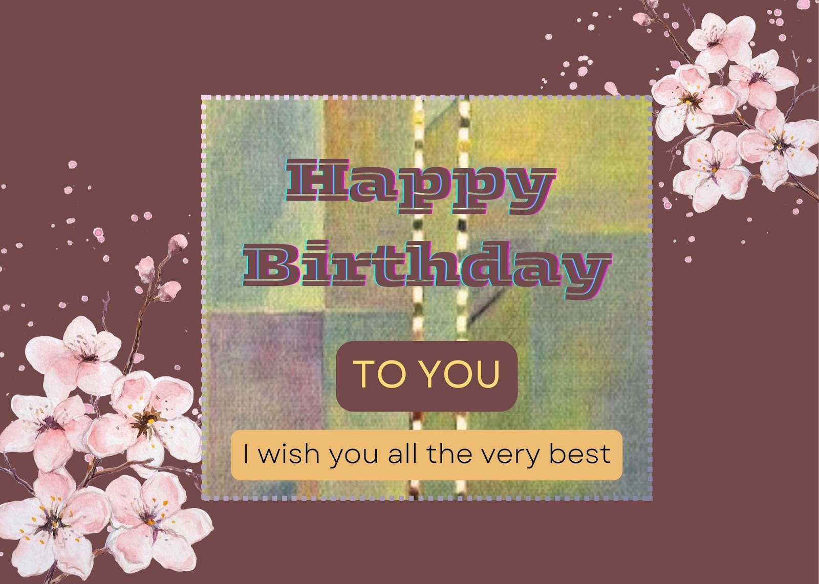
Remember to tailor your design to the occasion and the recipient's preferences for a truly special and personalized greeting card!
In my other designs here, I have made a simple card

There is no texture used but a simple plain background and viewpoint is the foreground one is typography lettering and second is the image with petals fallen off.
Tell me what is your viewpoint when you see this picture. Why?
Imagination goes wild when designing a pattern.
What do you see when making a Greeting cards?
When making a greeting card, here are some key decisions to consider:
1. *Occasion*: What is the card for (birthday, holiday, thank you, etc.)?
2. *Recipient*: Who is the card for (age, interests, preferences)?
3. *Message*: What is the main message or sentiment?
4. *Tone*: Is the tone formal, informal, playful, or heartfelt?
5. *Color scheme*: Choose colors that match the occasion and recipient's preferences.
6. *Imagery*: Select graphics, illustrations, or photos that complement the message.
7. *Typography*: Pick fonts that convey the tone and style.
8. *Design style*: Minimalist, elaborate, or something in between?
9. *Layout*: Balance elements for a visually appealing composition.
10. *Inside message*: Write a brief, heartfelt, or humorous message.
11. *Additional elements*: Consider adding embellishments like glitter, stickers, or ribbons.
12. *Size and shape*: Standard or non-traditional sizes and shapes can add uniqueness.
By considering these factors, you'll create a personalized and meaningful greeting card that shows you care!
Envisioning a greeting card design:
*Occasion:* Birthday
*Recipient:* A young adult who loves travel and adventure
*Message:* "Wishing you a journey filled with wonder and joy"
*Tone:* Playful and inspiring
*Color scheme:* Vibrant blues and whites, evoking a sense of sky and clouds
*Imagery:* A stylized illustration of a hot air balloon soaring above mountains
*Typography:* A bold, cursive font for the message, with a modern sans-serif font for the inside text
*Design style:* Whimsical and dreamy
*Layout:* Balloon centered, with text and colors harmoniously arranged
*Inside message:* "May your day be as bright as your spirit"
*Additional elements:* A sprinkle of glitter around the balloon for added festivity
This design combines elements to create a unique and captivating birthday card that resonates with the recipient's love of adventure and exploration.
And you can also personalize by choosing your own designs pattern for making a wonderful card.
There are plenty of choices for the card designs but for now you have three layers.

Whenever, I have to choose the typography lettering and the image either handmade or digital I go biserk. Well, anxiety has a calm thing in it and that is telling yourself to count 10-1.
So, what is your view of this beautiful Greeting cards. Do write it down in your comments. I will try and reply to you all as early as possible.
Thank you for your time especially with your work and support in visiting my ipage blog.
Cheers,
Gcb studios
Comments
Post a Comment