
Graphic designs pattern tile
A Graphic Design Pattern Tile Postcard is a visually striking and creative way to showcase a design concept. Here's a description of what it might look like:

All over type pattern tile

- *Repeating pattern*: A vibrant and intricate design element, such as a geometric shape or an organic motif, is repeated to create a seamless pattern.
- *Tile arrangement*: The pattern is arranged in a tile-like configuration, with each tile featuring a variation of the design element.
- *Color scheme*: A bold and harmonious color scheme is used to create visual interest and depth.
- *Postcard format*: The design is presented on a postcard-sized canvas, making it easy to share or display.
- *Graphic design elements*: The design incorporates various graphic design elements, such as typography, shapes, and textures, to add complexity and visual appeal.
This type of postcard can be used to:
- Showcase a designer's portfolio
- Promote a brand or product
- Share a creative idea or concept
- Add a decorative touch to a room or office
Overall, a Graphic Design Pattern Tile Postcard is a unique and eye-catching way to display a design concept and add a touch of creativity to any space.
Here are the pattern styles with a brief description of their meaning and inspiration:
1. *Galactic Bloom*: Represents growth, expansion, and beauty in the unknown. Inspired by the cosmos and the beauty of celestial bodies.
2. *Fractal Fusion*: Symbolizes unity, harmony, and the interconnectedness of all things. Reflects the infinite complexity of fractal geometry.
3. *Aurora Wave*: Embodies transformation, hope, and renewal. Captures the breathtaking beauty of the aurora borealis and its symbolic connection to change.
4. *Kaleido Chrome*: Exudes energy, playfulness, and creativity. Inspired by the colorful, symmetrical reflections of kaleidoscopes and the excitement of experimentation.
5. *Bio Lumina*: Represents life, resilience, and the magic of bioluminescent organisms. Celebrates the wonders of the natural world and the glow of inner light.
6. *Crystal Colony*: Signifies clarity, balance, and community. Inspired by the geometric beauty of crystals and the harmony of interconnected structures.
7. *Sonic Vortex*: Embodies movement, vibration, and the power of sound. Captures the dynamic energy of sound waves and their impact on our emotions.
8. *Mythic Mandalas*: Represents spiritual growth, self-discovery, and the connection to mythological heritage. Combines symbolic creatures and mandalas to inspire introspection.
9. *Nebula Nexus*: Symbolizes connection, exploration, and the infinite possibilities of the cosmos. Inspired by the breathtaking beauty of nebulas and galaxies.
10. *Prismatica*: Celebrates diversity, creativity, and the beauty of refraction. Showcases the vibrant colors and reflections of prismatic shapes, inspiring joy and playfulness.
These patterns not only add visual appeal but also carry meaningful symbolism, making them perfect for various applications, from art to design and beyond.
For example:- Crystal Colony is a pattern style I described earlier, characterized by:
- Geometric shapes inspired by crystal formations
- Interconnected structures, evoking a sense of community and harmony
- Pastel colors and iridescent finishes, giving a soft, ethereal appearance
Crystal Colony represents:
- Clarity: Reflecting the transparency and purity of crystals
- Balance: Symbolizing the harmonious arrangement of crystal structures
- Community: Inspiring a sense of connection and unity, like a colony of crystals growing together
This pattern style can be used in various designs, such as:
- Textiles (fabrics, wallpapers)
- Digital art and graphics
- Home decor and accessories
- Fashion and jewelry
Crystal Colony's soothing and calming atmosphere makes it perfect for creating a serene and peaceful environment.

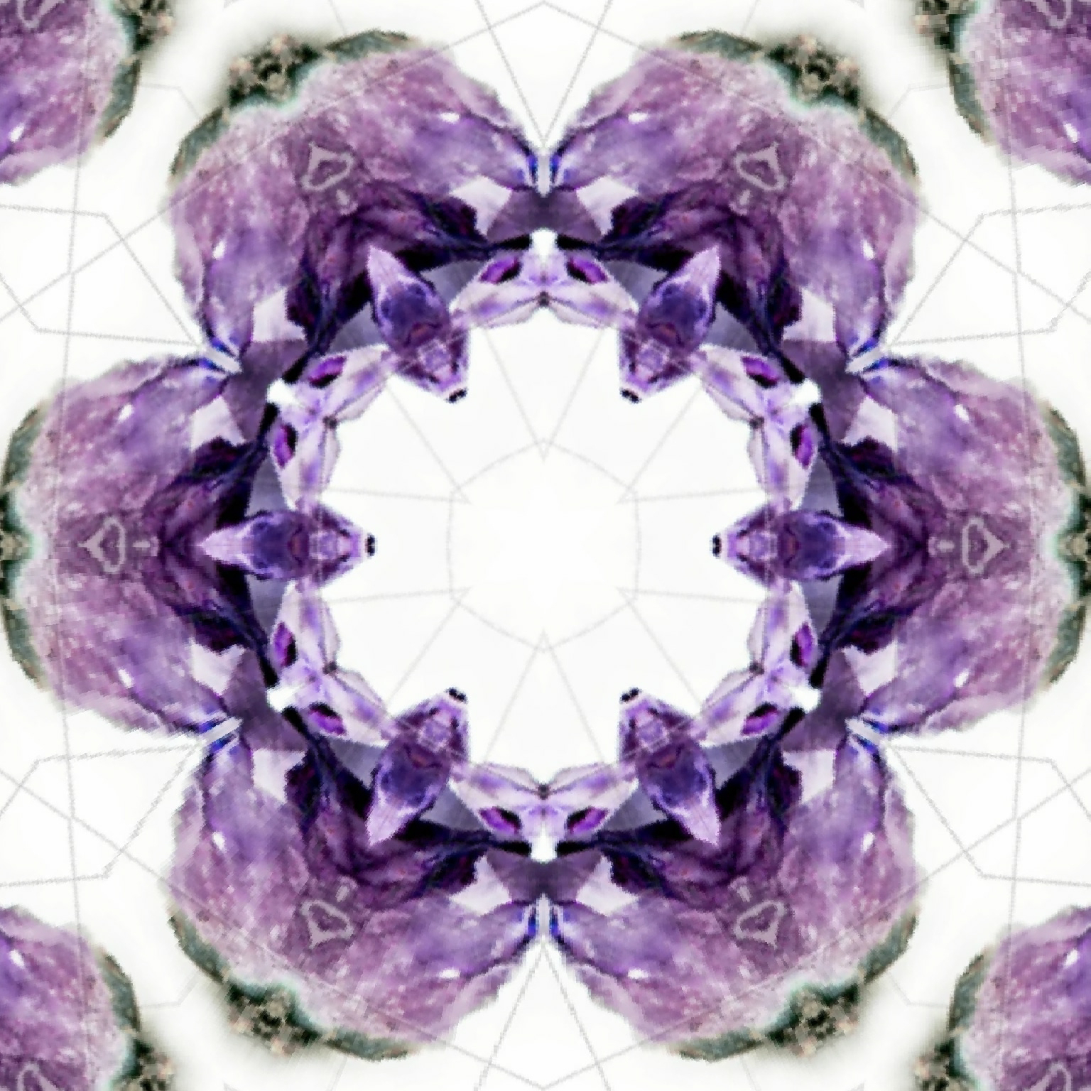
Lavender and mint green pattern tile
*Visual Description:*
- A repeating pattern of interconnected crystal-like shapes in soft, pastel hues (e.g., pale pink, lavender, mint green)
- Each crystal shape is geometric, with clean lines and symmetrical facets
- The shapes are arranged in a harmonious, organic way, as if they're growing together
- Iridescent finishes and subtle shading give the design a sense of depth and luminosity
- The background is a calming, creamy white or light gray, allowing the crystal shapes to take center stage
*Example Applications:*
- A fabric design for a soothing bedding set or curtains
- A wallpaper pattern for a serene home office or meditation room
- A design element in a wellness-focused branding or packaging
- A calming background texture for a digital art piece or website
*Color Palette:*
- Pastel pink (#E9D8BE)
- Lavender (#C7B8EA)
- Mint green (#B2FFFC)
- Creamy white (#F5F5F5)
- Light gray (#E5E5EA)
This example embodies the essence of Crystal Colony, combining geometric beauty, harmony, and a calming atmosphere.

Next, is a repeat pattern of Lavender and mint green pattern tile. (Crystal colony shown above)

- Lavender (#C7B8EA):
- Represents serenity, grace, and tranquility
- Adds a touch of sophistication and elegance
- Symbolizes clarity, calmness, and peacefulness
- Mint Green (#B2FFFC):
- Embodies freshness, renewal, and growth
- Brings a sense of coolness and serenity
- Represents balance, harmony, and nature
Together, lavender and mint green in the Crystal Colony pattern create a:
- Soothing and calming atmosphere
- Sense of balance and harmony
- Visual representation of serenity and peacefulness
- Beautiful contrast between warm and cool tones
- Unique blend of elegance and freshness
This color combination is perfect for designs where you want to evoke a sense of relaxation, calmness, and serenity, such as in wellness, self-care, or home decor applications.
I hope this project of my ipage blog must have been interesting. I have been really lost in my work. Hence, I always review my notes, data, and existing literature thoroughly. Look for patterns, connections, or insights you may have overlooked. Organizing your information can help provide new perspectives. So far so good 👍🏻👍🏻.
Thank you for your help in viewing and visiting my ipage blog.
Have a wonderful Tuesday!
Cheers,
Gcb studios
Comments
Post a Comment