Here are some graphic design project ideas:
 A brand identity is getting all the elements together.A brand identity gets the brand values making it intangible, making it difficult to quantify.

 Rupa got her pattern tile for the cherries. And then she and created a brand identity for building a logo. The pallet colors were selected.

 But this font was only being creative. So, she went ahead and drew some sketches.


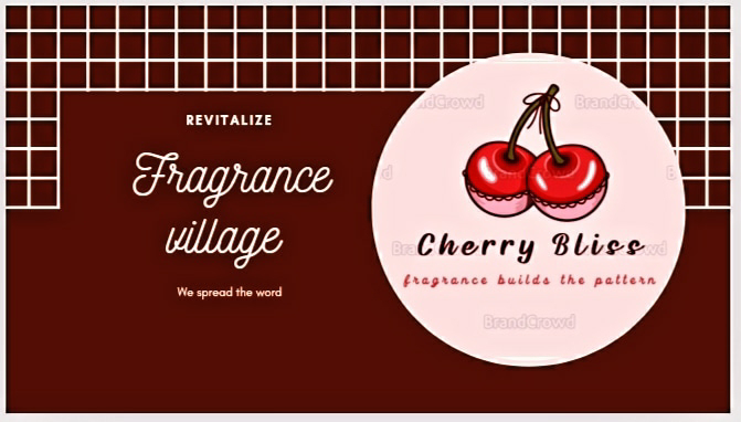 Here it is, the Brand name and the company name.
1. *Logo Design*: Create a logo for a fictional company or brand.
2. *Infographic*: Design an infographic that visualizes data on a topic like climate change or social media usage.
3. *Brochure Design*: Design a brochure for a travel agency or a wellness center.
4. *Poster Design*: Create a poster for a movie, concert, or event.
5. *Packaging Design*: Design packaging for a product like a coffee bag or a water bottle.
6. *Business Card Design*: Design business cards for a professional or a company.
7. *Social Media Graphics*: Create social media graphics for a brand or a campaign.
8. *Icon Design*: Design a set of icons for a mobile app or a website.
9. *Typography Project*: Explore typography by creating a typographic poster or a font design.
10. *Brand Identity*: Develop a brand identity for a fictional company, including a logo, color palette, and typography.
So, I chose 'Brand identity' as my project.
https://www.behance.net/gallery/201902805/CHERRY-BLISS Brand identity
Brand identity is the visible elements of a brand, such as color, design, and logo that identify and distinguish the brand in consumers' minds. If the brand is excellent then it satisfies the consumer and the customers. Then it increases its value and item become saleable in the market. There are two instances where the identity of a brand is connected with a symbol or visual aspect of illustration. The identity in many ways is the mascot of your brand which we are going to sketch.
Building Brand Identity
In building the Brand identity gets the company in a very cohesive and a confident state.
Points to build the Brand :-
1.Analyze the company
2.What are it's business goals
3.Customers identification
4.What is the communication or a message.
Which can include a company's name, logo, and design; its style and the tone of its copy; the look and the composition of brand.
Rupa thought of creating a wonderful project on Fragrance so, the pallet colors were selected.
A close-up shot of Rupa, a young woman with a warm, friendly face, standing in a well-lit, modern kitchen. She's wearing a simple white t-shirt and jeans, but her bright red lipstick and a playful glint in her eyes hint at her creativity. In her hands, she holds a bowl filled with ripe, glistening cherries.
'Rupa had always been obsessed with cherries. Their vibrant color, their sweet and tart flavor, their undeniable charm... It was the perfect inspiration for her new perfume brand.'
Rupa holds a small bottle of clear liquid, its label adorned with a stylized cherry blossom. She smiles, her eyes shining with excitement.
Rupa thought 'Cherry Bliss'. It's playful, sophisticated, and undeniably... *me*.'
A montage of panels showing Rupa brainstorming, sketching, and experimenting with different cherry-inspired scents.
'Months passed, filled with tireless research, endless testing, and the occasional cherry-flavored snack.'
Close-up on a hand holding a finished bottle of 'Cherry Bliss' perfume. The label is elegant, featuring a delicate cherry bliss design in shades of red and pink.
'Finally, the day arrived...'
Rupa, dressed in a stylish outfit with a touch of cherry red, stands confidently in a sleek store, her perfume bottles displayed on shelves. Customers browse, drawn in by the alluring scent of cherry bliss.
'The launch of Rupa's 'Cherry Bliss' perfume was a success. Her passion for the perfect scent, fueled by her love for cherries, had finally blossomed.'


Kindly, write your views on this brand identity project. And as to whether you would have launched a similar brand ( That is if, you have). What was the brand identity. And whether that brand has been sold to the customers.
Alright, now we come to the end of this beautiful session on
Parfume. Ohh I get the cherries smell 🍒. Next, is my favorite watercolor medium write up.
Thank you all for your time and support in visiting my ipage blog.
Have a wonderful weekend!!! 💓
Cheers,
Gcb studios
Comments
Post a Comment