
Typography signs
The old bookstore was a haven of forgotten stories, its shelves groaning under the weight of dusty volumes. But it wasn't the books themselves that drew Vami in, it was the typography. The signs, crafted from weathered wood and painted in faded hues, were like whispers from a bygone era.
Each sign, a unique piece of calligraphy, spoke volumes. 'History,' it declared, with a flourish that mimicked the unfolding of a parchment scroll. 'Science,' it offered, its letters stark and angular, echoing the precision of the scientific method. 'Romance,' it whispered, its curves as delicate as a love letter.
Vami had always been captivated by typography, its power to evoke emotions and tell stories without a single word. She wandered the aisles, tracing the letters with her fingertips, feeling the rough texture of the paint and the grain of the wood.
One sign, however, pulled her attention like a moth to a flame. It was a simple sign, made of rough-hewn pine, its letters stark and bold: 'Lost & Found.' But beneath the boldness, Vami sensed a melancholy, a whisper of stories left untold.
She found the owner, Mr. Hak, a man with eyes as faded as the bookstore's paint. 'That sign,' she asked, 'tell me about it.'
Mr. Hak chuckled, a dry, dusty sound. 'It's a reminder,' he said, his voice a gravelly whisper, 'that sometimes, we lose things, and sometimes, we find them.'
He spoke of the stories the sign had witnessed, of lost love letters and abandoned dreams, of journals with forgotten secrets and forgotten poems. He spoke of the hope it offered, the promise of rediscovery.
Vami spent hours that day, lost in the world of the bookstore. She felt the weight of the typography, the power of stories unspoken. And she realised that the signs weren’t just markers, they were doorways, leading to lost worlds and untold tales.
In the days that followed, Vami found herself drawn back to the bookstore. She would sit by the windows, watching the world go by, and lose herself in the beauty of the signs. She started to see the typography everywhere, in street signs, in shopfronts, even in the graffiti on the walls.
It became her obsession, the forgotten language of the signs, their whispers and shouts, their silent narratives. And she knew, with a certainty that went beyond words, that the stories weren't just on the pages of the books, but in the very heart of the lettering itself.
For Vami, the bookstore was no longer just a place of dusty books, but a sanctuary of forgotten stories, told through the timeless art of typography. It was a place where she could lose herself in the magic of words, and rediscover the power of stories whispered on the wind.
Vami had bought a new iPad mini case. She had begun making Watercolor paintings, and pattern tiles. Her passion was to create designs for she had also finished her Graphic designs. Then, one day she had an awesome idea so she grabbed a paper and pencil drawing lines. She was making Signs starting with normal and then doing 2d and 3d art.
Typography is a character or symbol that isn't considered to be a punctuation mark but may still be used in writing for various purposes.

Next, she made a next wonderful wallpaper.

Signage constitutes a small but highly-visible category of typographic design. Also referred to as graphic posters or banners, real estate signage. Types of signage can include monument signs, wayfinding signs, pole signs, and A-frame sidewalk.
Now, we are going to design a hand made wallpaper signage.
Materials
Sketches
Paper (ruled)
Microtip pencil


Painting acrylic Wallpaper signage
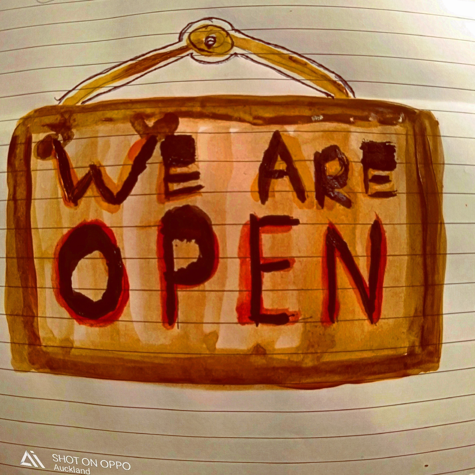
I had a wonderful time as I was getting on my creation. No wonder best research is better than unforseen errors.
Last but not the least was my final print which is handmade.

Now that I have done it in creating Typography signs, I should have more in printing the metallic typography signs as well. I will try my best for that sometimes next week.
Thank you all for your time and support in visiting my ipage blog.
Cheers,
Gcb studios
Have a nice day !
Comments
Post a Comment