Alphabets are usually linked with a standard of letters. This makes them useful for purposes of collation, sorted in a specific order, known as the alphabetical order.
Term Alphabets are useful for reading and writing.
Types of alphabet for example – small letters, capital letters, cursive letters, printable letters.
Calligraphy is writing letters with special tool and styles. Hand lettering is drawing letters using any tools you want. Fonts are digital tools such as keyboard. It involves beautiful writing using specific strokes.
Hand lettering
Lettering styles are typography designs of font, for specific projects. These could be business letterheads, customized signage, versatile fonts, or unique handwriting. This is in addition to handwritten document.
Lettering are of 10 types
Serif
Sans serif
Cursive
Graffiti
Monoline
Vintage
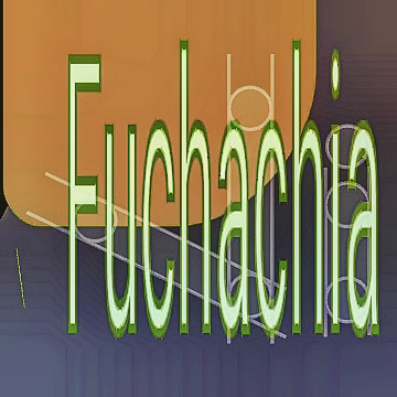
Creative fonts
Gothic
Modern calligraphy
Sub lettering
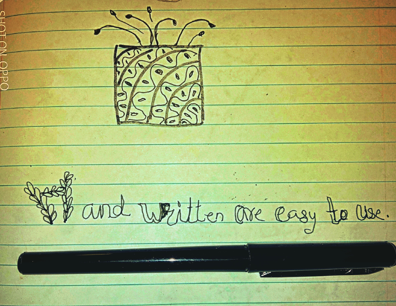
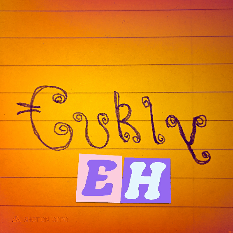
This whimsical pattern has got creativity and simple font print. And the title is special with specific color and style highlighted.
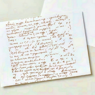
digital handwritten letter
Hand written creative
Practice, practice and practice your own hand written style. Hand written letters help you to build your muscles. And, whenever you are ready with your pen and paper to start writing.
Read~ https://www.lettering-daily.com/5-hand-lettering-effects/

Before you start with Hand lettering you should do some stretch outs or meditate for 15 -20 minutes. Then you start with your project. Practice lettering as it gives you the freedom to think 💬 about what you want to write and in which style and pattern. One should be very much patient with whatever you decide to do for this case writing font letters or words. Take your own time and then as you jot down every alphabet you should ask yourself what you want to do next and why. Then the response will result in good hand lettering. When you have chosen a phrase or a word take a tracing paper and write that particular font. Once you have sketched a good picture preferably with a mechanical pencil and blend that with a Black microtip pen then start manouvering your hand accordingly to its shape. When you finish the whole word you again step back and observe the writing. You will again practice this on a special card sample or a paper sample. You can use watercolor as a medium and a Brush pen to make it a bit colorful. My favorite is drawing a Whimsical pot or a geometric shapes for a background. Then choose a word 'Curly'. Pick which direction you want your light source to come from. Highlight with a marker or a pen. Then use a blending stub. You see a word standing out as though it is embossed. As an option you can draw the curly image adding that to the background.
𝕎𝕆ℕ𝔻𝔼ℝ𝔽𝕌𝕃 lettering gives you the feeling of expression of thoughts or ideas.
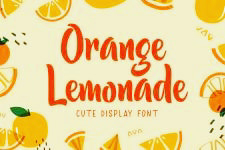
In this font not only expresses the words but also draws the attention to the images 'Orange'🍊 and 'Lemonade'🍋. Just let us say that it is an advertisement for a drink. The spicyness of the product comes to your mind and then you as a customer go in a store to grab the special deal.
The above print is a great example of the power of typography of advertisement. Where the contrast color yellow to the darker orange of a font actually drives the customer and the consumer in for buying that product.
One thing is sure advertisement tells the reader what tone of voice to read the message in.
Thank you for visiting and viewing my ipage blog. Next I will be writing ipage blog on using different mediums on Watercolor 🌊.
Cheers,
Gcb studio



Comments
Post a Comment