Spectrum watercolor pattern
 The watercolor spectrum chart is the best way to pinpoint your color. With it, you can view mixes between two colors and their dilution in a very precise way. With this chart, you'll never be confused about how much water or how much of each color you need to make ever again!

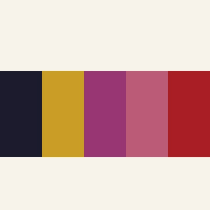
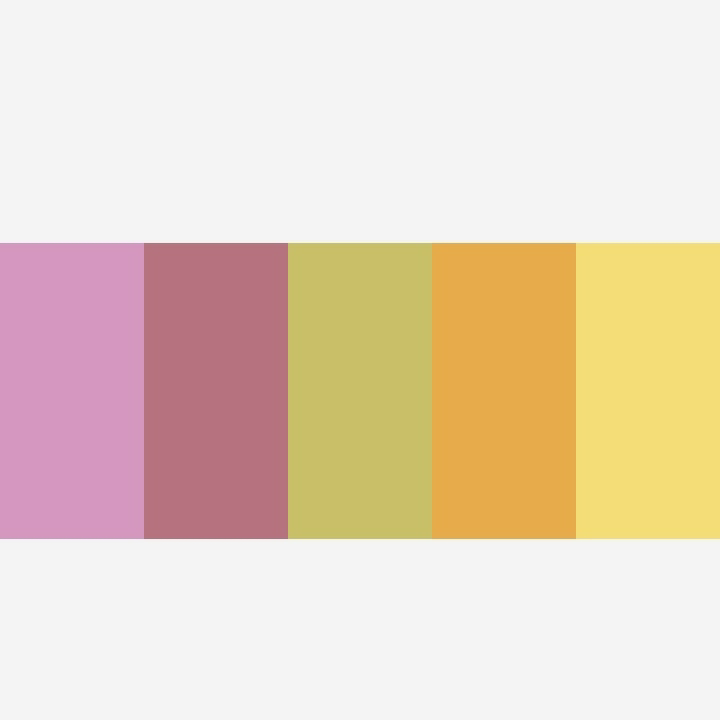

Next, is this image on Abstract.
 It has a color values for the abstract.

 Here, the shades are of original with dark and light colors shown. The electromagnetic lights that equates to the colors the human eye can see.
Now, these are the color values of Spectrum watercolor pattern. They are from original color to light to dark color values.
Next, is this image on Abstract.
Spectrum colors refer to a range of colors that are arranged in a specific order, typically in a gradient or rainbow-like pattern. The traditional spectrum colors are:
1. Red
2. Orange
3. Yellow
4. Green
5. Blue
6. Indigo
7. Violet
These colors are also known as the "ROYGBIV" colors, with each letter standing for the name of a color.
You can create a spectrum color effect using the colors available on a color wheel or palette. To do this:
1. Select a starting color (e.g., red).
2. Gradually transition to the next color (e.g., orange), blending them smoothly.
3. Continue this process, moving through the colors in order (yellow, green, blue, indigo, violet).
You can create a spectrum effect using various mediums like paint, markers, colored pencils, or digital tools.
Let's explore specific techniques for creating a spectrum color effect in different mediums:
*Painting:*
1. Gradated wash: Mix colors to create a gradual transition between hues.
2. Glazing: Apply multiple thin layers of transparent paint to achieve a spectrum effect.
*Digital Art:*
1. Gradient tool: Use software like Adobe Photoshop or Illustrator to create a gradient.
2. Color blending modes: Experiment with different blending modes to achieve a spectrum effect.
*Markers/Colored Pencils:*
1. Layering: Build up layers of color to create a gradual transition.
2. Blending: Use blending stumps or tortillons to merge colors.
*Print Design:*
1. Gradient fills: Use design software like Adobe InDesign to create gradient fills.
2. Color ramps: Create a color ramp to transition between colors
The watercolor spectrum technique is a beautiful way to create a soft, dreamy effect with colors. Here's a step-by-step guide to achieve this technique:
Materials needed:
- Watercolor paper
- Watercolor paints
- Wet-on-wet technique (apply wet paint to wet paper)
- Gradient colors (choose your spectrum colors)
Steps:
1. Wet the paper with clean water.
2. Mix a light wash of the first color (e.g., red).
3. Apply the wash to the paper, starting from one edge.
4. While the paint is still wet, mix a second color (e.g., orange).
5. Apply the second color wash, blending it into the first color.
6. Repeat this process, adding each color in a gradual transition (yellow, green, blue, indigo, violet).
7. Allow each layer to blend and merge with the previous one.
8. Let the painting dry completely.
Tips:
- Use a large brush to create soft, fluid strokes.
- Experiment with different water-to-pigment ratios for desired transparency.
- Embrace happy accidents and let the colors blend organically.
This technique creates a beautiful, ethereal spectrum effect with soft, blended colors. That is going to be my task sometimes this week.
Thank you so very much for your time and support in visiting my ipage blog.
Enjoy the sunny day ahead !
Cheers ⛄
Gcb studios
Comments
Post a Comment