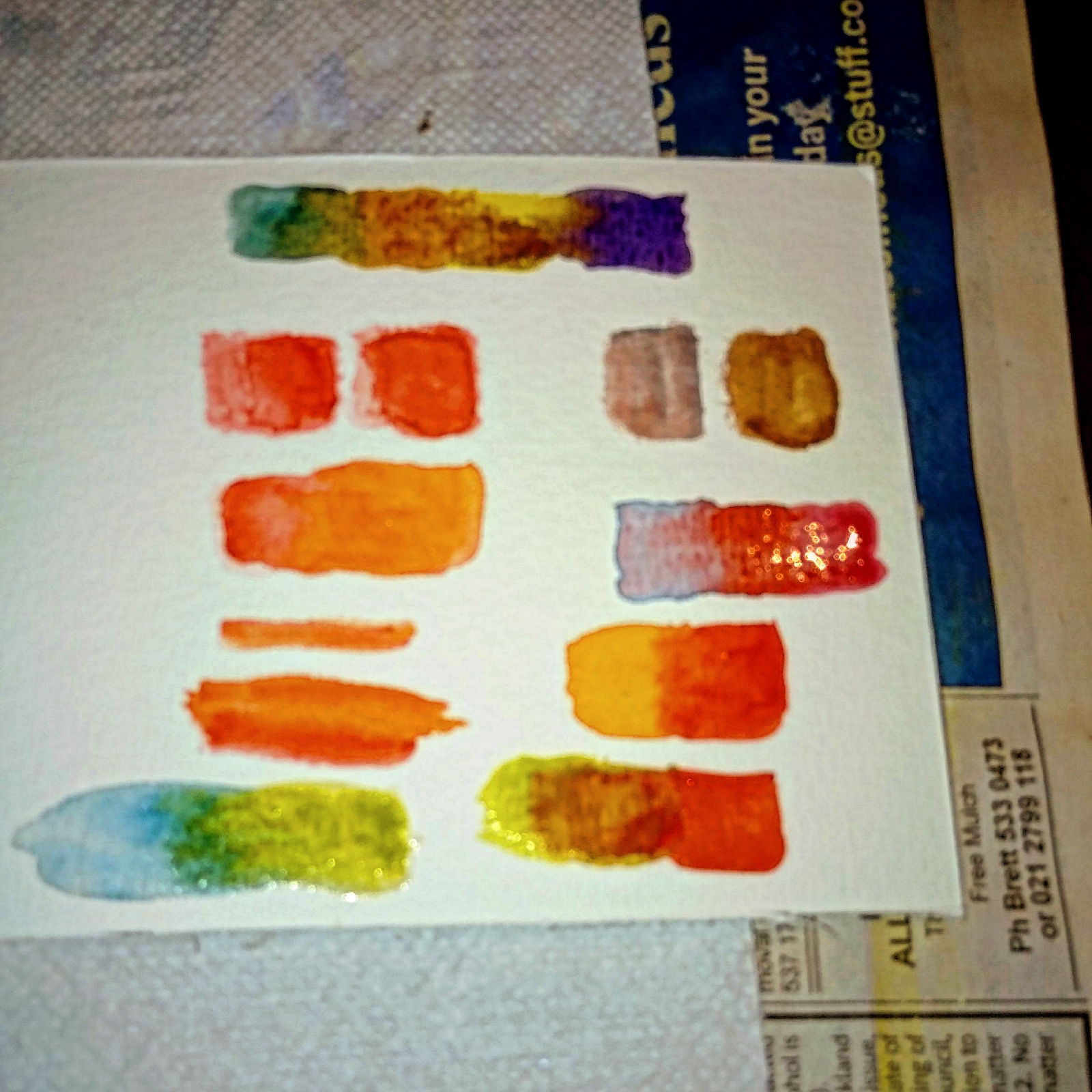
How to get color values :
 Hand bag watercolor magic
"The Art of Color Blending: A Watercolor Spectrum Tutorial"
As inspiration comes up with reading few books on Color theory and my own unique color blending illustration.
The art of color blending is a technique used to merge two or more colors together to create a new, harmonious shade or gradient. It involves combining colors in a way that creates a smooth, seamless transition between them.
Color blending can be achieved through various mediums, such as:
1. Painting (watercolor, acrylic, oil)
2. Drawing (markers, colored pencils, pastels)
3. Digital art (graphic design, illustration, photography)
The key elements of color blending include:
1. Color selection: Choosing colors that work well together (e.g., analogous, complementary, triadic)
2. Ratio and proportion: Balancing the amount of each color used
3. Gradation: Creating a smooth transition between colors
4. Layering: Building up layers of color to achieve depth and nuance
5. Blending techniques: Using specific methods, such as glazing, scumbling, or merging
Effective color blending can:
1. Create a sense of depth and dimension
2. Enhance mood and atmosphere
3. Add texture and visual interest
4. Establish color harmony and cohesion
5. Elevate the overall aesthetic of a piece
By mastering the art of color blending, artists and designers can unlock new creative possibilities and bring their vision to life!
The watercolor spectrum technique is a beautiful way to create a soft, dreamy effect with colors. Here's a step-by-step guide to achieve this technique:
Materials needed:
- Watercolor paper
- Watercolor paints
- Wet-on-wet technique (apply wet paint to wet paper)
- Gradient colors (choose your spectrum colors)
Steps:
1. Wet the paper with clean water.
2. Mix a light wash of the first color (e.g., red).
3. Apply the wash to the paper, starting from one edge.
4. While the paint is still wet, mix a second color (e.g., orange).
5. Apply the second color wash, blending it into the first color.
6. Repeat this process, adding each color in a gradual transition (yellow, green, blue, indigo, violet).
7. Allow each layer to blend and merge with the previous one.
8. Let the painting dry completely.
Tips:
- Use a large brush to create soft, fluid strokes.
- Experiment with different water-to-pigment ratios for desired transparency.
- Embrace happy accidents and let the colors blend organically.
This technique creates a beautiful, ethereal spectrum effect with soft, blended colors.
The mixture of the red ♥️ and orange 🧡 gives us the vermilion color. It really is the depth of a color used. Green and red mixed create a brown color.
Color blending with Watercolor technique orange, red and green.
You see two colors in addition to ORG and that is the yellow and brown colors.
Color theory by Chinky
A group of artists are gathered around a table, discussing color theory.
The artists were discussing the basics of color theory.
One of the artists, Chinky, holds up a color wheel and explains the primary, secondary, and tertiary colors.
(Chinky): The primary colors are red, yellow, and blue. The secondary colors are green, orange, and purple. And the tertiary colors are the colors that are made by mixing a primary color with a secondary color.
Another artist asks Chinky about the difference between warm and cool colors.
(Artist): What's the difference between warm and cool colors?
Chinky explains that warm colors are those that are associated with the sun and fire, such as red, orange, and yellow. Cool colors are those that are associated with water and ice, such as blue, green, and purple.
(Chinky): Warm colors are those that are associated with the sun and fire, such as red, orange, and yellow. Cool colors are those that are associated with water and ice, such as blue, green, and purple.
The artists continue to discuss color theory, and Chinky explains how colors can be used to create different effects in artwork.
The artists continued to discuss color theory, and Chinky explained how colors can be used to create different effects in artwork.
The artists thank Chinky for her insights, and they all agree that they have learned a lot about color theory.
(Artist): Thanks for sharing your knowledge with us, Chinky! We've learned a lot today.
The artists thanked Chinky for her insights, and they all agreed that they had learned a lot about color theory.
Color Blending: A Harmonious Union of Colors
Color blending, the art of merging colors, creates a visually appealing and harmonious palette. By combining colors, artists and designers can achieve a range of effects, from subtle shifts in tone to bold, eye-catching gradients.
Color blending is a powerful tool in the creative process, allowing artists and designers to:
- Create depth and dimension
- Evoke emotions and moods
- Add texture and visual interest
- Establish color harmony and cohesion
- Elevate the overall aesthetic of a piece
By understanding color theory and techniques, creatives can unlock the full potential of color blending, transforming their work into stunning, harmonious masterpieces.
Remember, color blending is a skill that can be developed with practice, patience, and a willingness to experiment and explore. Embrace the world of color and unleash your creativity!
I had an amazing time doing this project called Color theory. Though this was a part of color blending process. Next will be a color theory in detail.
Thank you for your time and support in visiting my ipage blog.
Cheers,
Gcb studios


Comments
Post a Comment